

Research Assistant

BACKGROUND
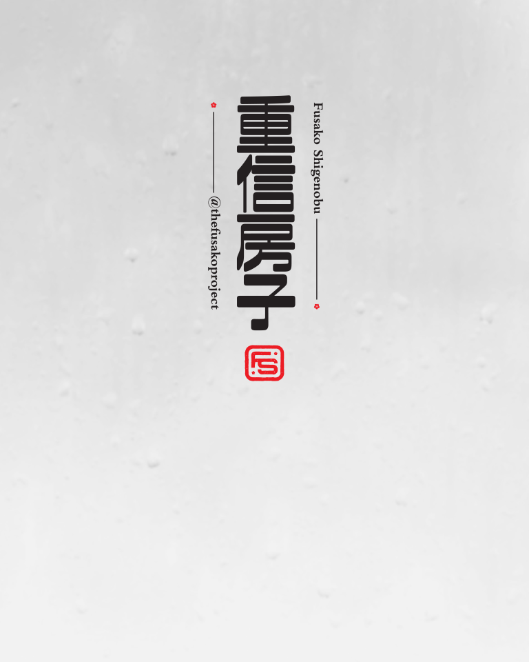
Project Lead: May Shigenobu
Project Manager: Professor Setsu Shigematsu
Student Team: Self, Hadiya, Hana, Jay, & Sharmeen
Project Overview:
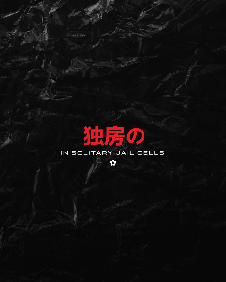
This campaign was part of a non-profit, independent study under Professor Setsu Shigematsu at the University of California, Riverside. May Shigenobu, the project lead, reached out to Professor Shigematsu to put together a team of students to collaborate on a project to spread the truth and quell disinformation spread about her mother Fusako Shigenobu, which culminated in her release from prison. Fusako, a Palestinian Freedom Fighter from Japan, was once branded as a terrorist by the Japanese government and subsequently imprisoned in 2000 for crimes she did not commit. In the end, the only crime she was found guilty of was falsifying passport information, a crime that did not justify her 20 years in solitary confinement in a Japanese prison.
My role in this project was to initially create a logo and branding for this campaign, alongside other students worked on social media collateral and videos. The odd scheduling of the project presented the first obstacle: we needed assets to upload onto social media but the process of branding was still ongoing. This made the designs inconsistent between the branding to social media teams.
After the logo and branding were established, I was then tasked with creating flyers and promotional material for a press conference during Fusako’s prison release. Throughout the 10-week campaign, team members would meet bi-weekly (both in-person and via Zoom) to collaborate and review each other’s projects we have been working on in order to make the deadline. Oftentimes, we would also have to coordinate with May Shigematsu who was overseas in Beirut and Japan throughout this project. The campaign ended with the students organizing a live-streaming watch party on campus, of Fusako’s release from prison while simultaneously working with the live team in Japan.
iNITIAL dIRECTION
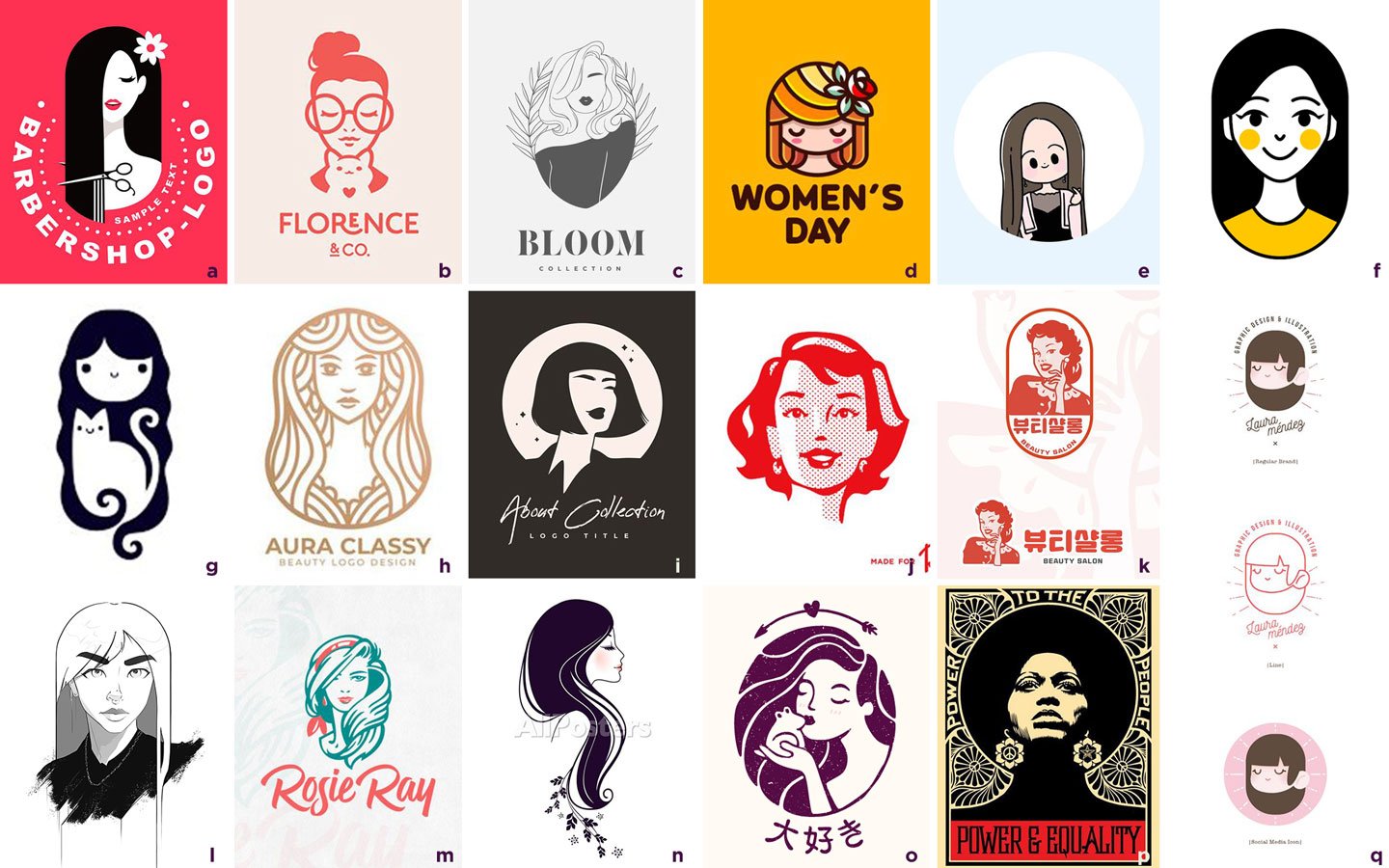
In order to get an idea of what direction to go in, I initially presented a variety of logos to team members that I felt met the requirements of the project guidelines:
Create a manga/anime-styled illustrated logo of Fusako
Have the initials “F.S.” represented in the design
Design a campaign that appeals to younger generations but still feels a bit “mature”
Team members then narrowed their selection down to 3 options: I, J, and L.

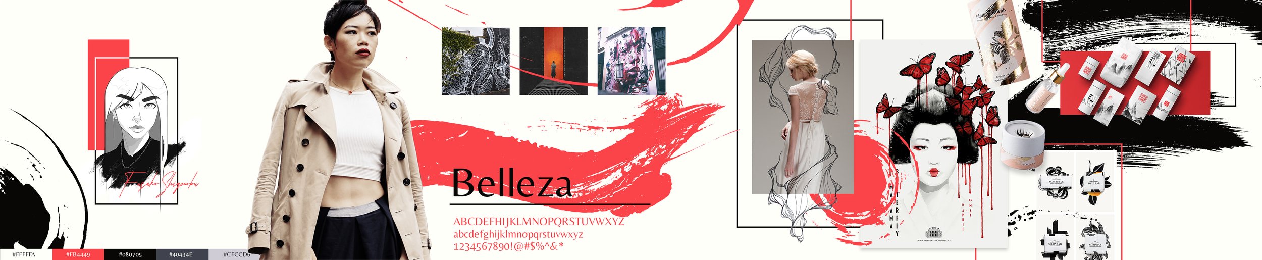


INITIAL STYLESCAPES
The next step was to then design three conceptually different stylescapes based on the team’s selected options dubbed—from left to right—Modern Elegance (I), Fiercely Traditional (L), Retro Pop Idol (K). Various group members provided feedback and critique on the presented designs, listing pro’s and con’s of each concept.
Feedback:
Modern Elegance, although a favorite, felt a bit too premium for our target audience but the sakura (cherry blossom) design elements were well received
Fiercely Traditional was liked for the more “painterly” feel that made it feel more organic. The color and brush strokes however, were too reminiscent of blood splatters (we wanted to refrain from referencing any violence at all)
Came to the decision to eliminate Retro Pop Idol from our choices as it did not fit well with the aesthetic we were aiming for but did like the color palette
Feedback allowed me to go back and create an entirely new stylescape, combining what was liked across the previous stylescapes and removing elements that were disliked. The result was a manga/anime inspired design that brought in design elements from all three previous concepts. May Shigenobu’s initial design requirement of a manga-inspired logo was fully incorporated into this stylescape.
FINAL STYLESCAPE
The road to the finalized stylescape was longer than any of us expected, mostly due to indecision on the color palette. In the end, we decided to go with a wide variety of colors to help appeal to our target audience. This was also inline with the color palette the social media team was using in the mean time, giving a bit more cohesion between the two projects. We also changed our user persona profile image to reflect our target audience better as well. The logo placed here was a quick sketch done by me just to give an idea of how it could look. This stylescape could have been fleshed out a bit more but the team felt like we established the direction we wanted to go in at this point but were now spending too much time on this part and needed to move on.

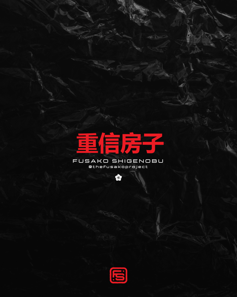
FINAL LOGO
Logo Exploration
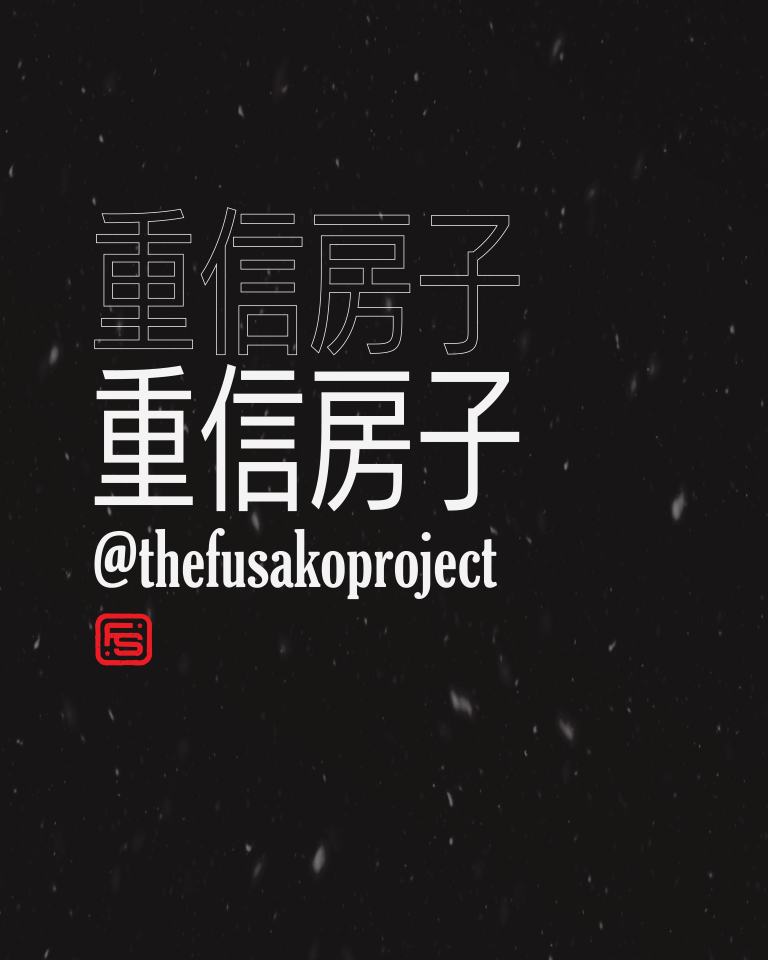
Towards the campaign’s conclusion and subsequent release of Fusako from imprisonment, the decision was made by the project lead for the colors be changed to a simple red, white, and black palette to reflect Shigenobu’s current branding from her published books about her life. We also settled on not using an illustrated logo for the time being and focused on the initials instead.
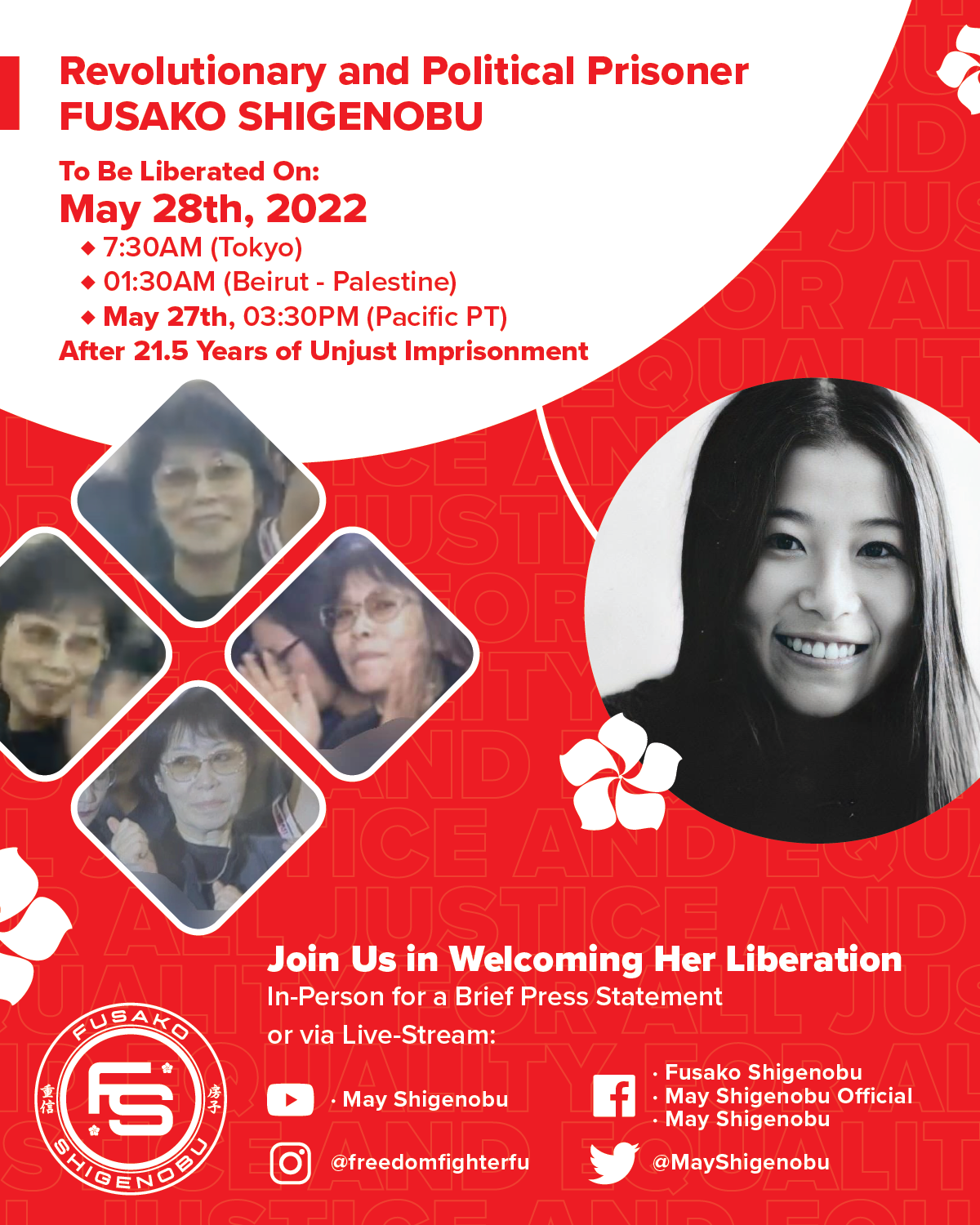
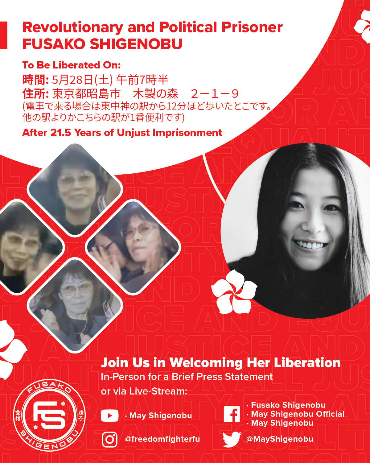
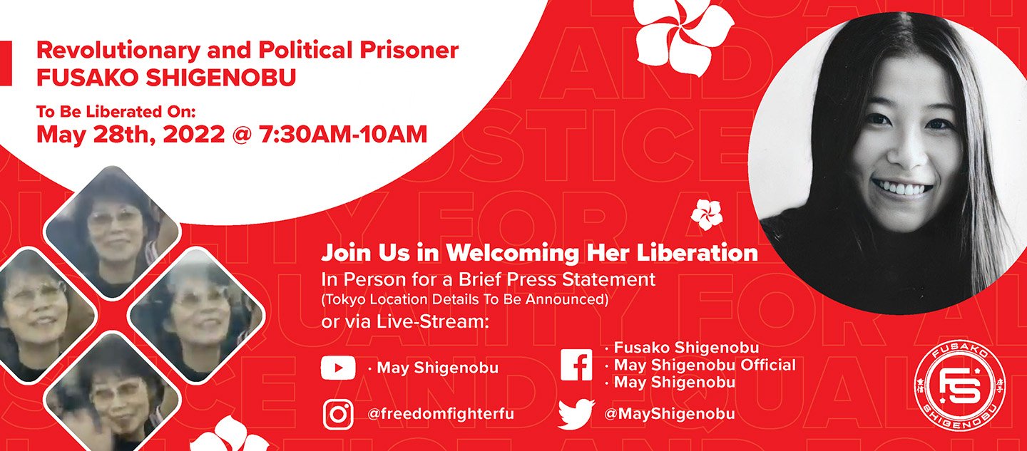
English and Japanese flyers for social media
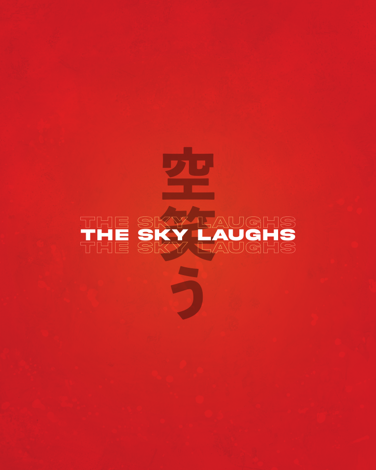
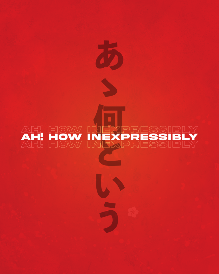
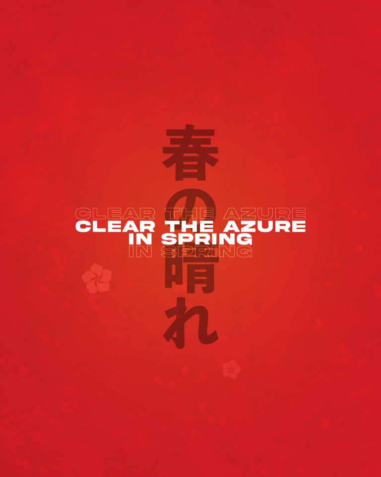
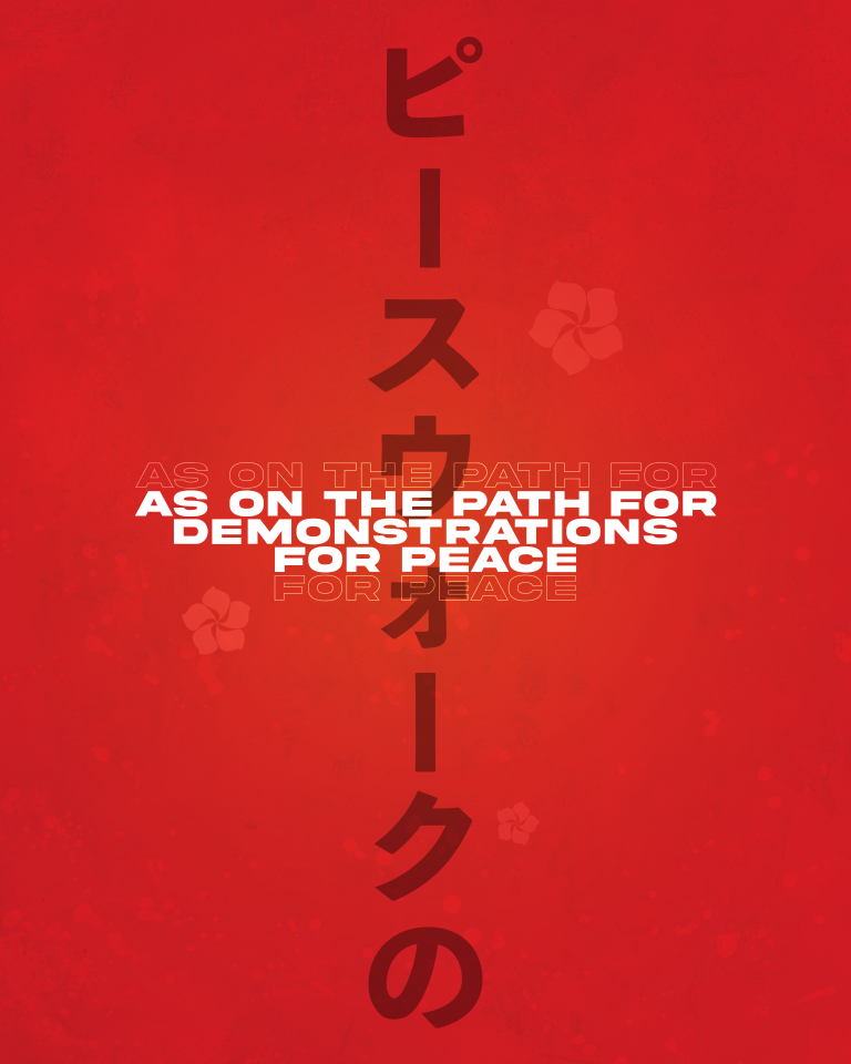
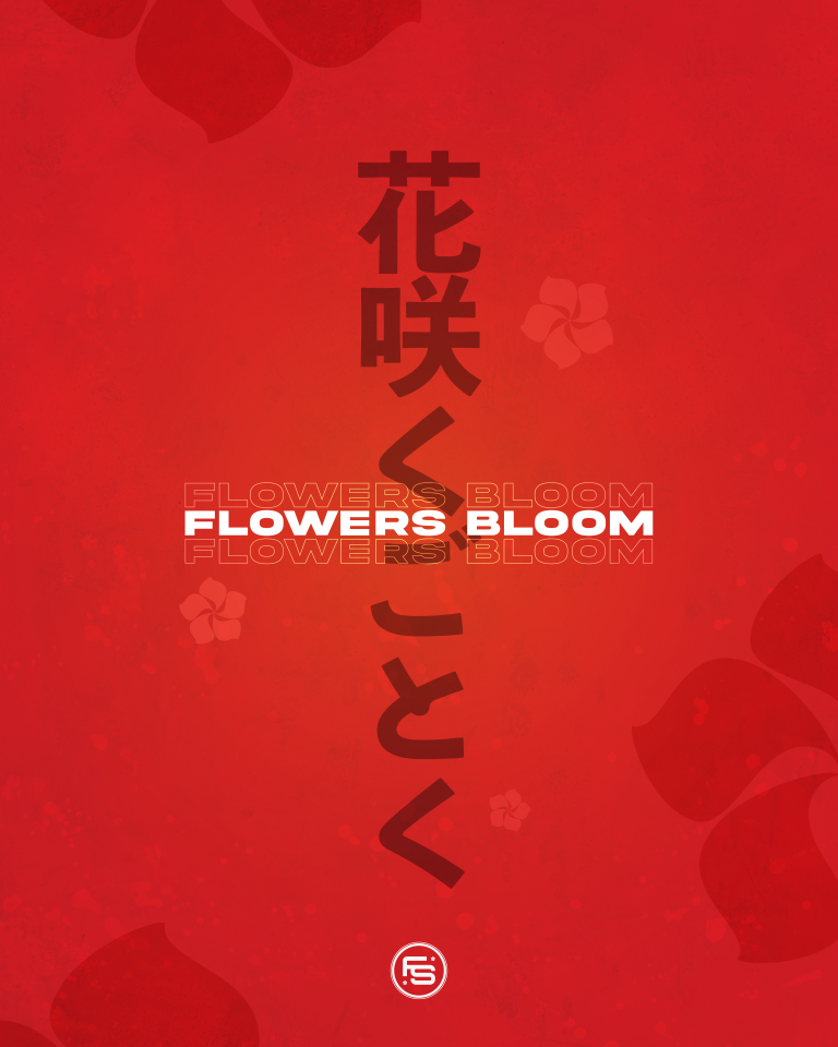
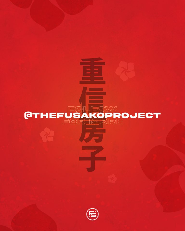
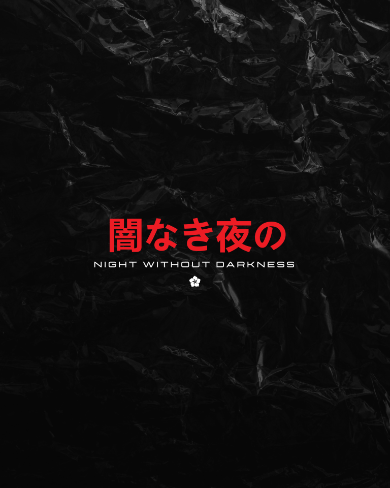
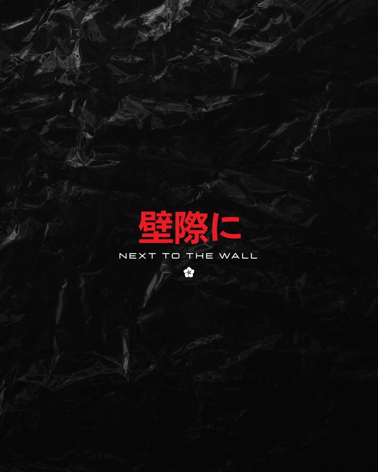
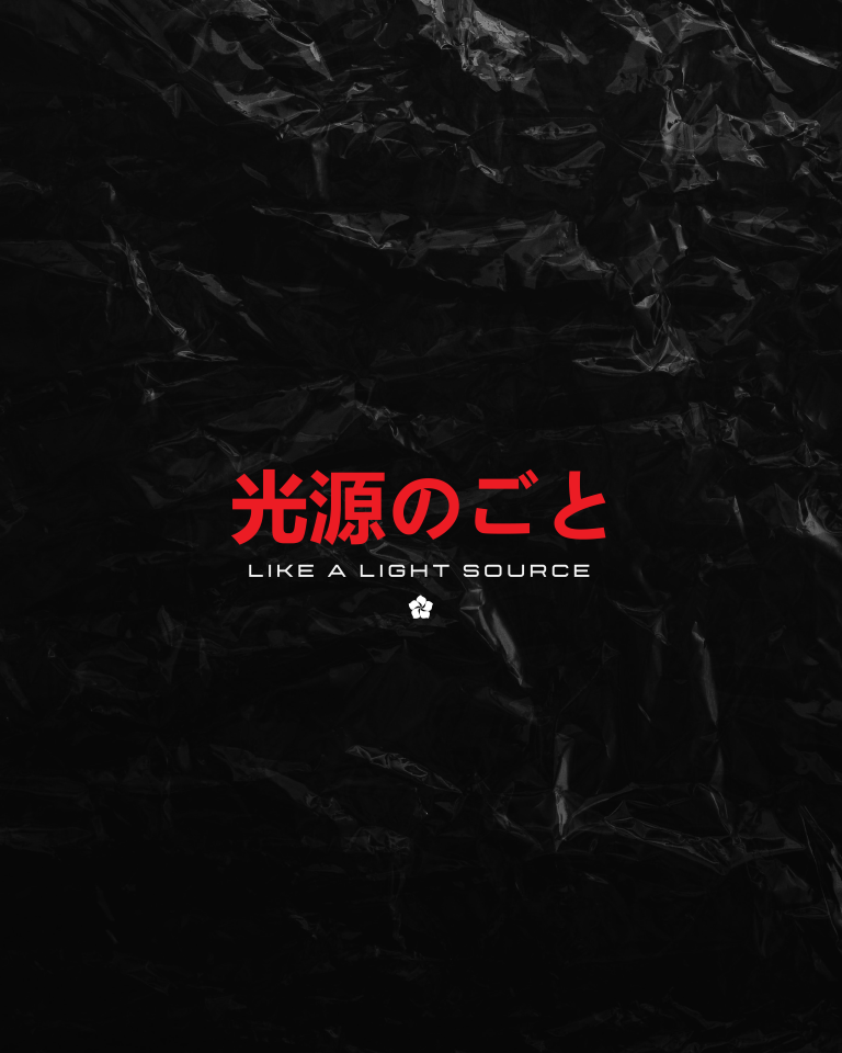
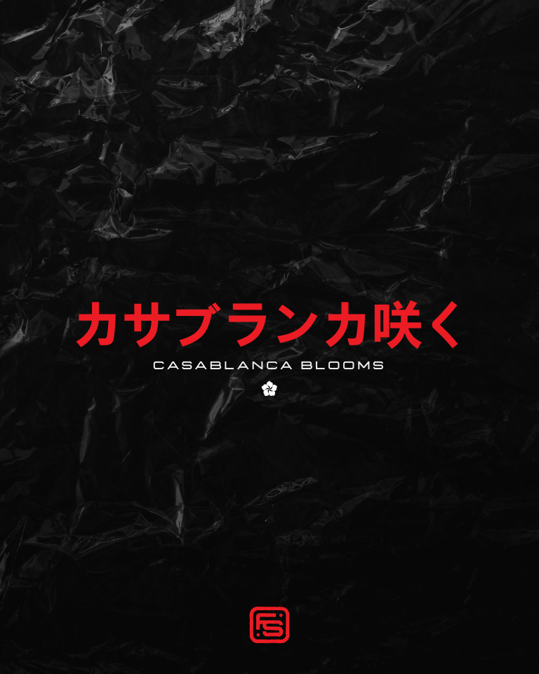
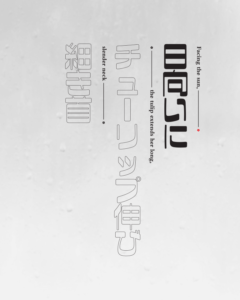
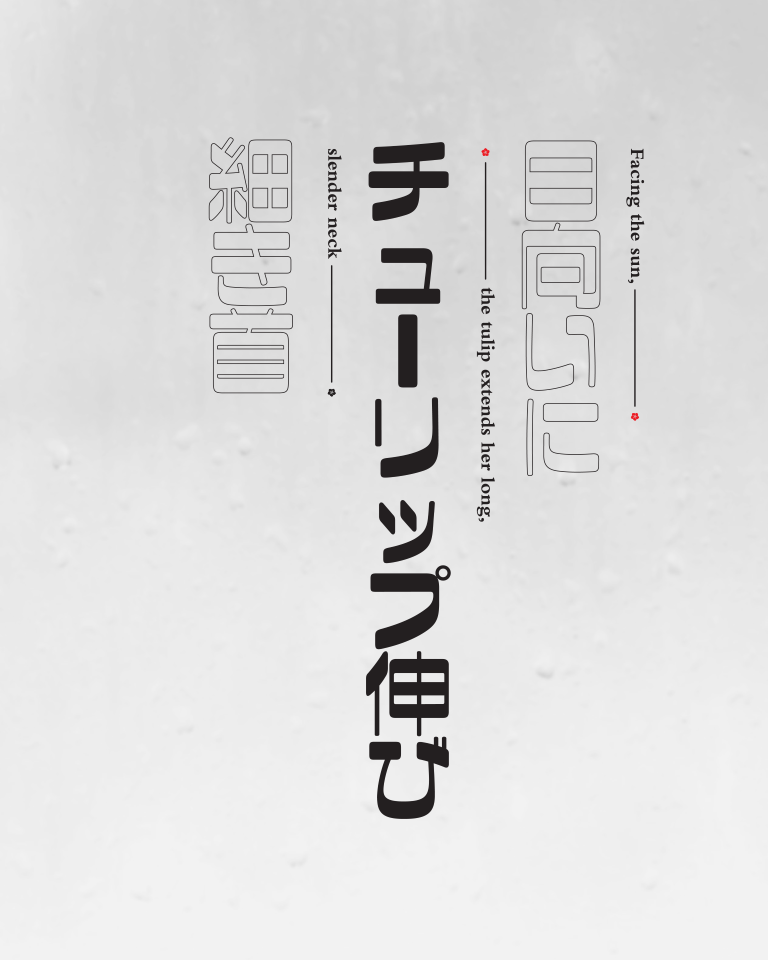
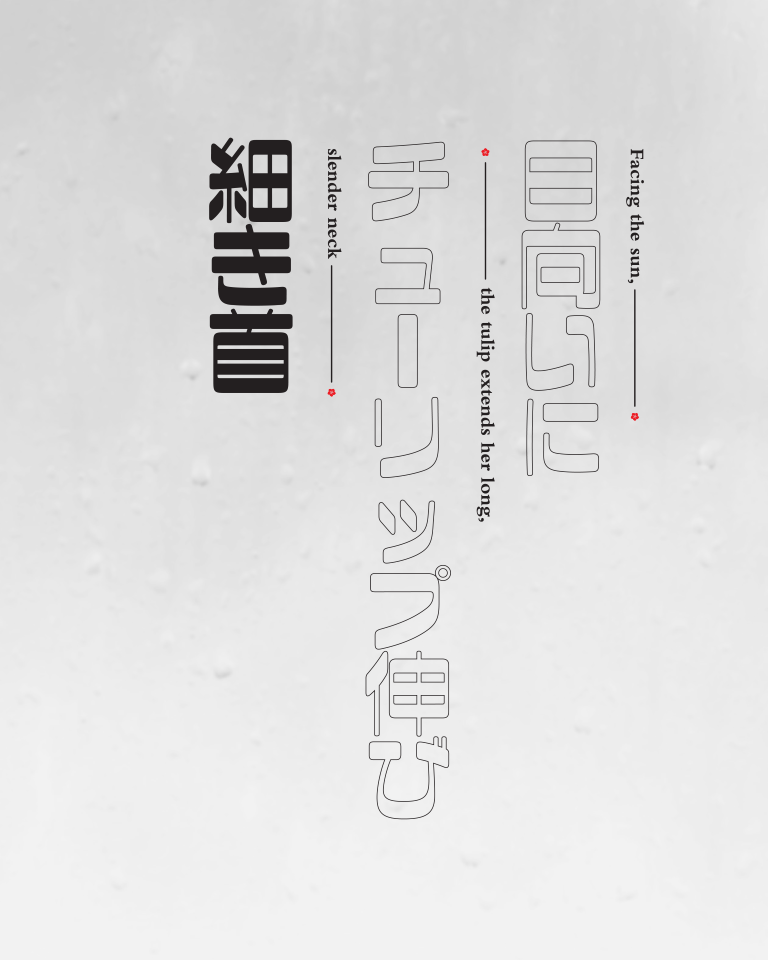
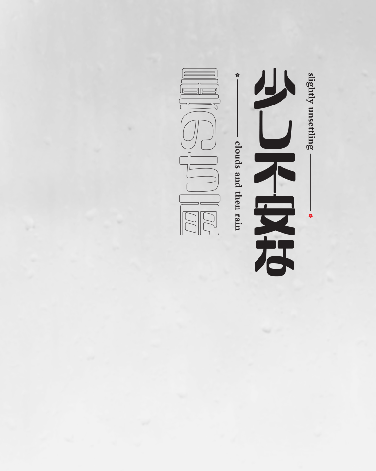
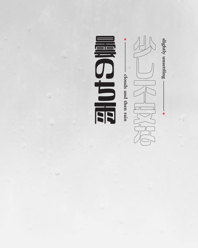
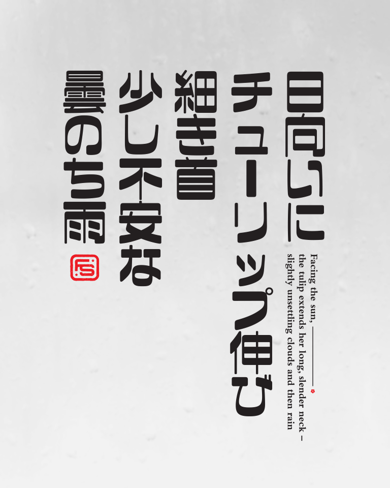
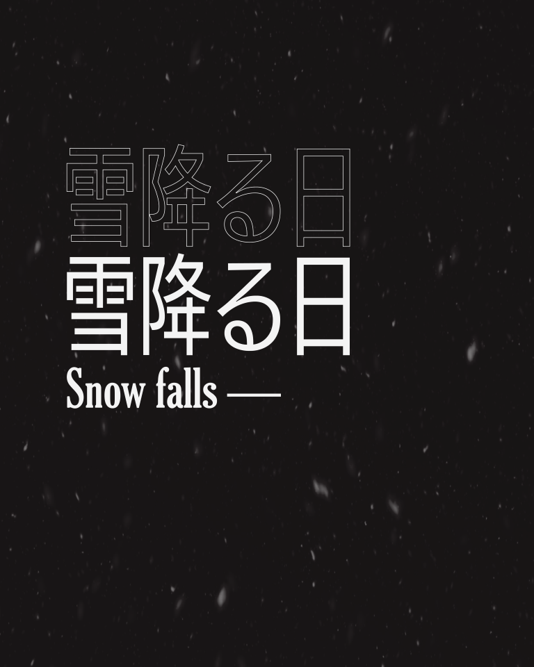
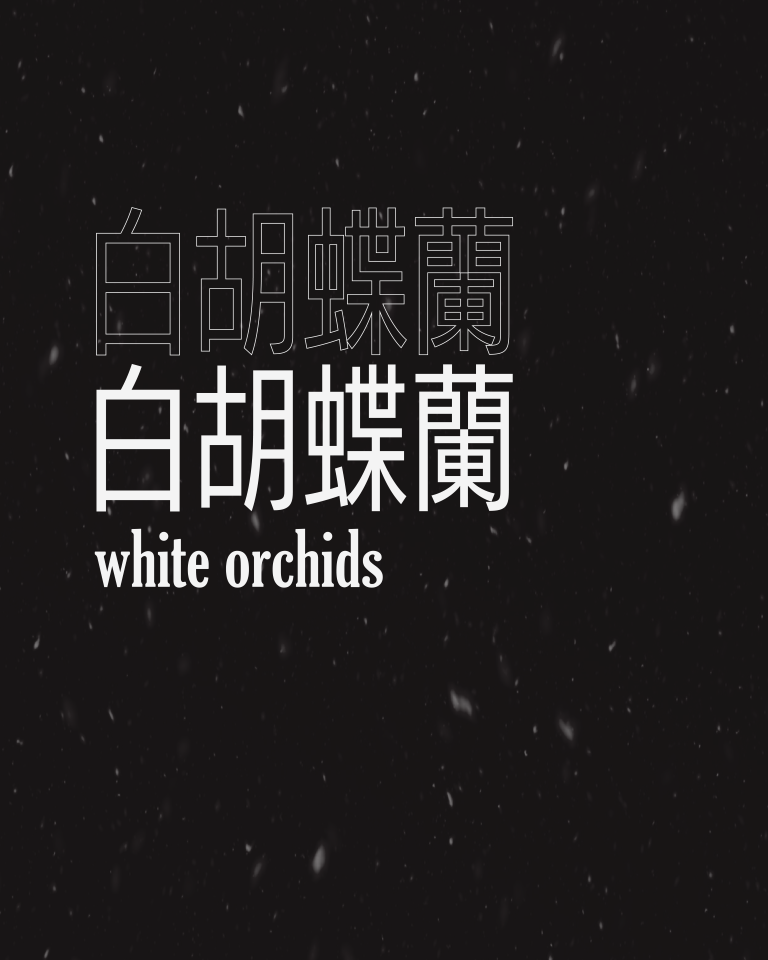
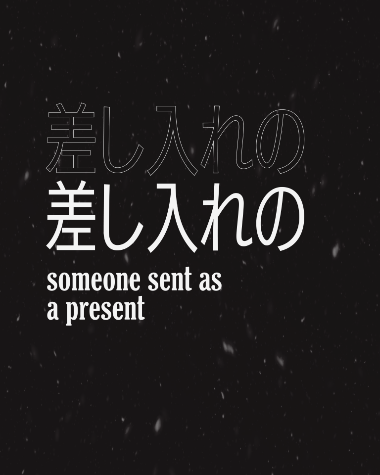
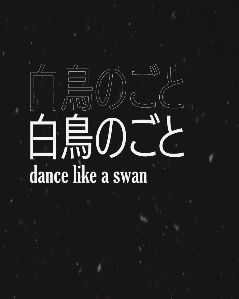
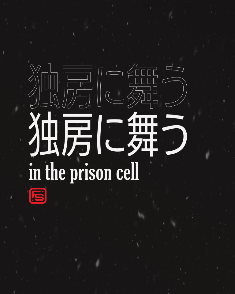
Poems written by Fusako Shigenobu and designed for social media
FINAL THOUGHTS & Outcomes
The most challenging obstacle our team had to overcome was the project lead not being available towards the beginning of the campaign due to traveling between countries and other unforeseen circumstances. Our team decided to move forward with the initial design process without them due to our time constraints. This led to major changes being made about halfway through the design process. Having to coordinate with our team in Japan in the final hours of the project also proved to be a noteworthy challenge while also hosting a live-viewing event on campus in at UCR.
Overall, this was a fulfilling project that I very much enjoyed being a part of. It was wonderful working on a meaningful project that has reached many people around the world.
Image via Al Jazeera
